A broken date picker is one of the fastest ways to lose a booking, an appointment, or a signup. Yet most React projects still ship a calendar widget that was bolted on in an afternoon: the native <input type="date"> renders differently in every browser, and a dropdown that fights the user’s muscle memory quietly kills conversion on checkout flows. Date selection is one of the most-used form controls on the web, and choosing the wrong date-picker library is a decision you will pay for in accessibility tickets and feature requests for years.
The three libraries that dominate the React ecosystem in 2026 — react-datepicker, react-day-picker, and react-calendar — look interchangeable at a glance, but they have fundamentally different philosophies. react-datepicker is a batteries-included widget with time selection and a popper. react-day-picker is a headless-first calendar rebuilt from scratch in v10 with WCAG 2.1 AA compliance. react-calendar is a zero-config embedded calendar with month, year, and decade views. One of them is right for your project; the other two will cost you styling or accessibility hours.
TL;DR: Which React Date Picker Should You Actually Use?
If you need a form-ready dropdown with time selection today, pick react-datepicker — it has the most features, the biggest community (8,383 stars), and the most Stack Overflow answers, at the cost of a heavier bundle and weaker default accessibility. If you are building a custom calendar UI and care about accessibility, pick react-day-picker — its v10 rewrite is the most modern of the three, ships WCAG 2.1 AA compliance, and lets you own the markup. If you need an embedded calendar widget (a sidebar, a “pick a month” panel, a decade selector), pick react-calendar — it is the simplest API on the market and does one thing well. Do not pick react-datepicker for an accessibility-critical public form, and do not pick react-calendar when you need a dropdown or time input.
Feature Comparison Table
Data fetched from GitHub on 2026-08-24. All three are MIT-licensed.
| Feature | react-datepicker | react-day-picker (v10) | react-calendar |
|---|---|---|---|
| GitHub stars | 8,383 | 6,847 | 3,788 |
| Last push | 2026-04 | 2026-08 | 2026-08 |
| License | MIT | MIT | MIT |
| Dropdown/popper input | ✅ Built-in | ⚠️ Build it yourself | ❌ Inline only |
| Time selection | ✅ showTimeSelect | ❌ | ❌ |
| Range selection | ✅ | ✅ mode="range" | ✅ |
| Multiple days | ✅ | ✅ | ❌ |
| Localization | ✅ date-fns locales | ✅ any language | ✅ Intl |
| Accessibility | ⚠️ Known gaps | ✅ WCAG 2.1 AA | ⚠️ Partial |
| Bundle (gzipped) | ~140 KB with CSS | ~13 KB core | ~15 KB |
| Custom components | ⚠️ Via props | ✅ Full control | ⚠️ Limited |
| TypeScript | ✅ | ✅ | ✅ |
Use-Case Decision Matrix
| Use case | Recommendation | Why |
|---|---|---|
| Booking form with date + time | react-datepicker | Only one of the three with built-in time selection and a popper |
| Public-facing form with strict accessibility requirements | react-day-picker | WCAG 2.1 AA compliance is a hard requirement for many orgs |
| Custom-designed calendar in a design system | react-day-picker | You control every rendered element; no fight with default styles |
| Embedded “pick a month/year” widget | react-calendar | One component, zero config, decade view included |
| Internal admin tool, time-to-ship matters most | react-datepicker | Fastest path from npm install to working UI |
| Form library integration | react-day-picker + your input | Controlled value API fits react-hook-form cleanly (see our React form libraries guide) |
react-datepicker: The Batteries-Included Workhorse
react-datepicker (Hacker0x01/react-datepicker, 8,383 stars, MIT, last push April 2026) has been the default answer to “React date picker” for a decade. It is maintained by Hacker0x01, the company behind HackerOne, and its npm downloads are an order of magnitude above its competitors. The pitch is simple: install, import CSS, get a working calendar dropdown with time selection, ranges, min/max dates, and locale support out of the box.
| |
| |
The showTimeSelect prop is the killer feature: 30-minute intervals by default (timeIntervals to change), and dateFormat="Pp" renders date and time together. Localization uses date-fns locale objects with registerLocale / setDefaultLocale helpers:
| |
Where it hurts: the component is opinionated. You get a fixed DOM structure, a bundled CSS file you must import, and the default styles are aggressively recognizable — every app using react-datepicker looks alike until you fight the CSS. Accessibility has known gaps (focus management and screen-reader announcements are imperfect), which is a real problem for public-facing forms. It also pulls in date-fns and its own popper logic, so the bundle is the heaviest of the three.
react-day-picker: The Modern, Accessible Rebuild
react-day-picker (gpbl/react-day-picker, 6,847 stars, MIT, last push August 2026) went through a ground-up rewrite for v10 — the package is now published as @daypicker/react — and it shows. The v10 architecture is the most modern of the three: TypeScript-first, CommonJS and ESM builds, and a minimal core of about 13 KB gzipped. It relies on date-fns for date math and formatting, exactly like react-datepicker, but it ships calendar only — no input, no popper, no styles imposed on your app.
| |
| |
Selection modes cover single, multiple, and range (mode="range"), plus fully custom selections. The headline feature in 2026 is WCAG 2.1 AA compliance: keyboard navigation, proper ARIA attributes, and focus management are first-class, which is rare among calendar components. Localization goes beyond the usual date-fns locales — the docs cover ISO 8601, Persian, Hijri, Buddhist, Ethiopic, and Hebrew calendars through add-on packages, plus time-zone handling. Styling is yours: the component renders semantic markup you can target with any CSS framework, which makes it a natural fit for design-system work.
Where it hurts: day-picker gives you a calendar, not a date input. You must build the input+popover wiring yourself (the docs have a dedicated guide for input integration, but it is your code). If you want a working dropdown in ten minutes, this is extra work. And v10 is a hard break from v9 — the old react-day-picker API and props are gone, so legacy integrations need a migration pass (see the pitfalls below).
react-calendar: The Zero-Config Embedded Calendar
react-calendar (wojtekmaj/react-calendar, 3,788 stars, MIT, last push August 2026) is the smallest of the three in scope and in ambition. It is built and maintained by Wojciech Maj, who also maintains react-pdf and react-time-picker. The entire API is: install, import, render <Calendar />, use onChange. It supports picking days, months, years, or even decades, and range selection — nothing more, and nothing less.
| |
| |
The README’s tagline is “No moment.js needed” — it uses the native Intl API for localization, which keeps the bundle small and avoids the date-fns dependency entirely (react-datepicker and react-day-picker both depend on date-fns). The view hierarchy — month → year → decade → century — makes it the right tool for anything that is not a single-day input: “which month did this report run”, “pick a fiscal year”, analytics dashboards.
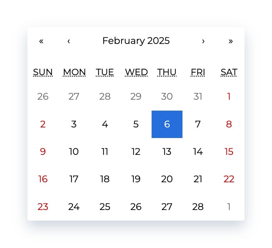
Where it hurts: it is inline-only. There is no dropdown, no time selection, and no portal behavior. The default styling is dated and customization goes through CSS overrides rather than component slots. It also relies on Intl browser support, so exotic locales on older browsers need a polyfill (the README points to Intl.js). If your requirement is a classic form date input, this is the wrong tool — but it is the best “calendar widget” of the three.
Pitfalls and Migration Gotchas
1. react-day-picker v10 is a breaking rewrite. The package moved to @daypicker/react, and almost every prop changed (selectedDays → selected, initialMonth → defaultMonth, onDayClick → onSelect). If you find a tutorial from 2023, it will not run on v10. The old package name still resolves on npm but is frozen; plan a migration day.
2. react-datepicker’s CSS must be imported. The component renders unstyled without import "react-datepicker/dist/react-datepicker.css". This is the number-one “why does my picker look broken” issue, and it silently fails in setups that tree-shake CSS.
3. Time zones will bite you. All three libraries work with Date objects in the browser’s local time. A “birthdate” field stored as UTC midnight renders as the previous day in negative-offset time zones. Serialize date-only values as YYYY-MM-DD strings (date-fns format(date, "yyyy-MM-dd")), never as ISO timestamps, or you will debug off-by-one-day bugs at 3 AM.
4. Bundle size is a real difference. react-datepicker ships a popper, date-fns, and CSS — roughly 10x the core payload of react-day-picker’s calendar. On a marketing page where the picker is one of fifty components, that matters.
5. Accessibility is not a checkbox. react-datepicker’s screen-reader experience is passable but not WCAG-certified; several issues around focus and announcements have been open for years. If your product must meet WCAG 2.1 AA (public sector, healthcare, finance), react-day-picker is the only one of the three that documents compliance.
6. Do not build your own picker. “It’s just a calendar, how hard can it be?” — keyboard navigation, month transitions, leap years, locale week starts, and RTL layouts are exactly the edge-case soup that these libraries have spent a decade fixing. For a related rabbit hole, see our comparison of React select libraries — the same “build vs install” trap applies to every input-type component.
7. Check your React version. All three require React 16.8+ (hooks era). If you are still on React 16, react-day-picker v10 and the latest react-calendar are fine, but verify peer dependencies in your lockfile before upgrading.
Final Verdict
There is no single winner because the three libraries are not competing for the same job. react-datepicker owns the “working form input, fast” slot with time selection and a popper; react-day-picker owns the “accessible, custom, design-system-native” slot after its v10 rewrite; react-calendar owns the “embedded calendar widget” slot with a three-line API. Match the library to the interaction, not to the star count, and you will avoid the two most common failure modes: an inaccessible public form and a month of CSS fighting. The same role-based thinking that separates these three also separates React hooks libraries — pick by job, not by popularity.
FAQ
Which React date picker is the most popular?
react-datepicker is the most popular by a wide margin — 8,383 GitHub stars and the highest npm download count of the three, plus a decade of Stack Overflow answers. react-day-picker (6,847 stars) and react-calendar (3,788 stars) trail in popularity but are actively maintained with 2026 pushes.
Is react-datepicker still maintained in 2026?
Yes. The Hacker0x01 team pushed updates as recently as April 2026, and the package receives regular releases. It is not the fastest-moving project in the ecosystem, but it is stable and battle-tested across thousands of production apps.
Which React date picker is best for accessibility?
react-day-picker v10 is the clear winner — it documents WCAG 2.1 AA compliance with keyboard navigation, ARIA attributes, and focus management built in. react-datepicker has known accessibility gaps, and react-calendar’s accessibility is partial (its README does not document compliance).
How do I add a time picker to my date picker?
Only react-datepicker supports time selection out of the box: add the showTimeSelect prop and set dateFormat="Pp" (or your own pattern). For react-day-picker and react-calendar you would need a separate time input component, which is one reason booking-style forms usually end up on react-datepicker.
Do these libraries support date ranges?
Yes — react-datepicker and react-day-picker support range selection natively (mode="range" in day-picker), and react-calendar supports range selection via a two-element value array. Range booking flows are a common reason teams standardize on one of these three.
Can these libraries be used with TypeScript and react-hook-form?
All three ship TypeScript types. react-day-picker’s controlled selected/onSelect API integrates cleanly with react-hook-form’s Controller — see our React form libraries guide for the integration pattern. react-datepicker also works but its props are less strictly typed.
What is the migration path from react-day-picker v9 to v10?
The package is now @daypicker/react, selection props changed (selectedDays → selected, onDayClick → onSelect), and styling moved to @daypicker/react/style.css. Budget a dedicated migration pass — v9 code does not run on v10 without changes.
Should I just use the native <input type="date">?
For a simple optional date field in an internal tool, yes — native inputs are accessible, free, and consistent with the OS. The moment you need range selection, time picking, custom styling, or a consistent cross-browser experience, a library is worth it. That trade-off is a classic dependency decision — only reach for a library when it solves a real problem.
💰 想测试你的市场判断力?我用 Polymarket 做预测市场交易——这是全球最大的预测市场平台,从大选结果到技术监管时间线,什么都可以押注。和赌博不同,这是真正的信息市场:你懂的信息越多,胜率越高。我靠预测技术相关事件的走向已经赚了不少。用我的邀请链接注册:Polymarket.com